Google Rolls Out Visual Redesign and Layout Changes for YouTube Music Web App
Google seems to be making changes to the visual design and layout of YouTube Music, aiming to align it more closely with the overall YouTube service. Currently, YouTube Music has a layout with various categories such as Home, Explore, Library, and Search located at the top of the page.
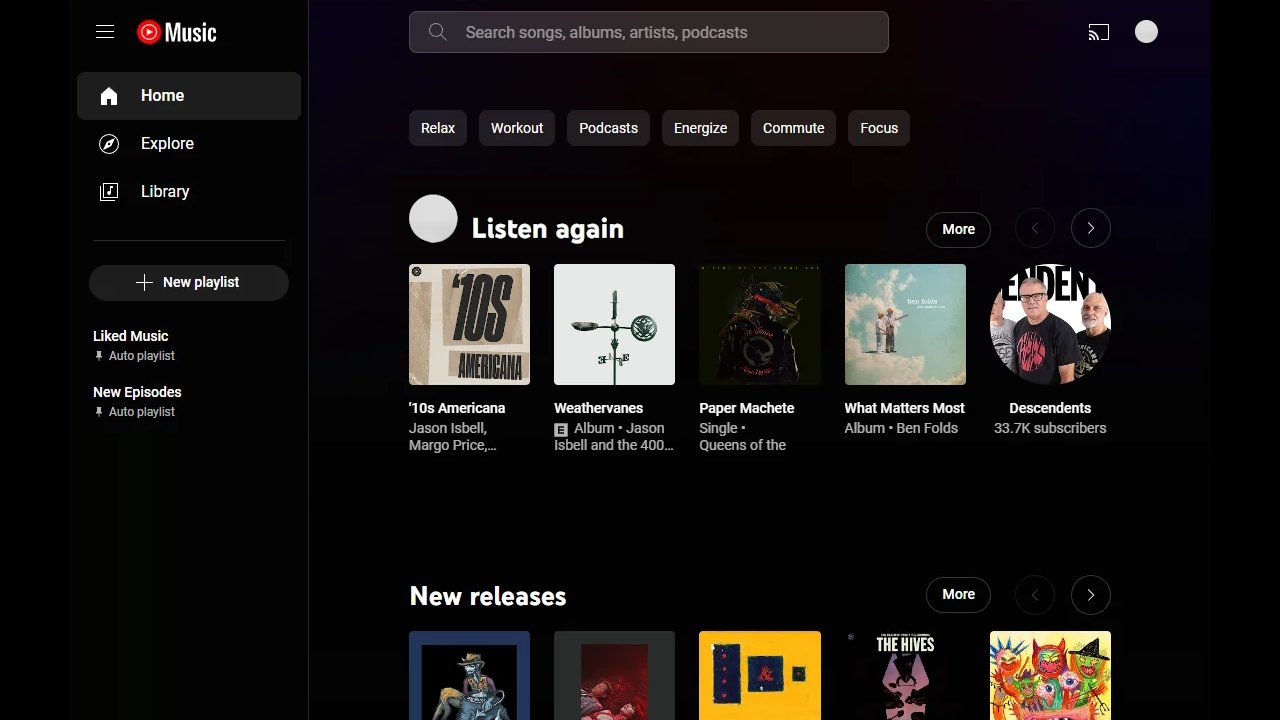
However, Google is implementing significant changes to the YouTube Music layout in certain areas. The most notable change is the introduction of a left-hand navigation menu, shifting Home, Explore, and Library to the left side of the app. Users can now access playlists and create new ones more easily. Another significant alteration is the search functionality, which now features a search bar at the top, replacing the previous button. The music categories have also been relocated to the top left, resembling the layout of the YouTube app.
It's worth mentioning that this layout change appears to be part of a controlled rollout and may not be visible to all users. Some regions might already experience the new design, while others are still awaiting its arrival. The goal behind this transformation is to create a more unified look and feel between YouTube and YouTube Music.
At present, it remains uncertain whether this layout change is exclusive to YouTube Music subscribers. Some reports suggest that Google might be rolling out the update to subscribers only, while non-subscribers may not observe the changes. However, confirmation is needed to ascertain this.